Discovering an Opportunity (make action oriented)
As this project stemmed from my personal curiosity, I sought to bridge the gap by consolidating various networks and resources into a single hub. (don't need this 1st paragraph)
After conducting external research and analyzing competitors, I discovered that most pregnancy apps offer similar features, such as courses, resources, and a community platform. While there are numerous "birth networks" sites for individual states, there is no app that connects them all. Additionally, none of the apps offer maternal resources on a state-by-state basis.
Struggles
Issues that individuals encounter while using these applications and websites involve insufficient detailed data about pregnancy and targeted promotions that provoke anxiety. (this is great for the presentation, but for portfolio can fold in the success and struggles)
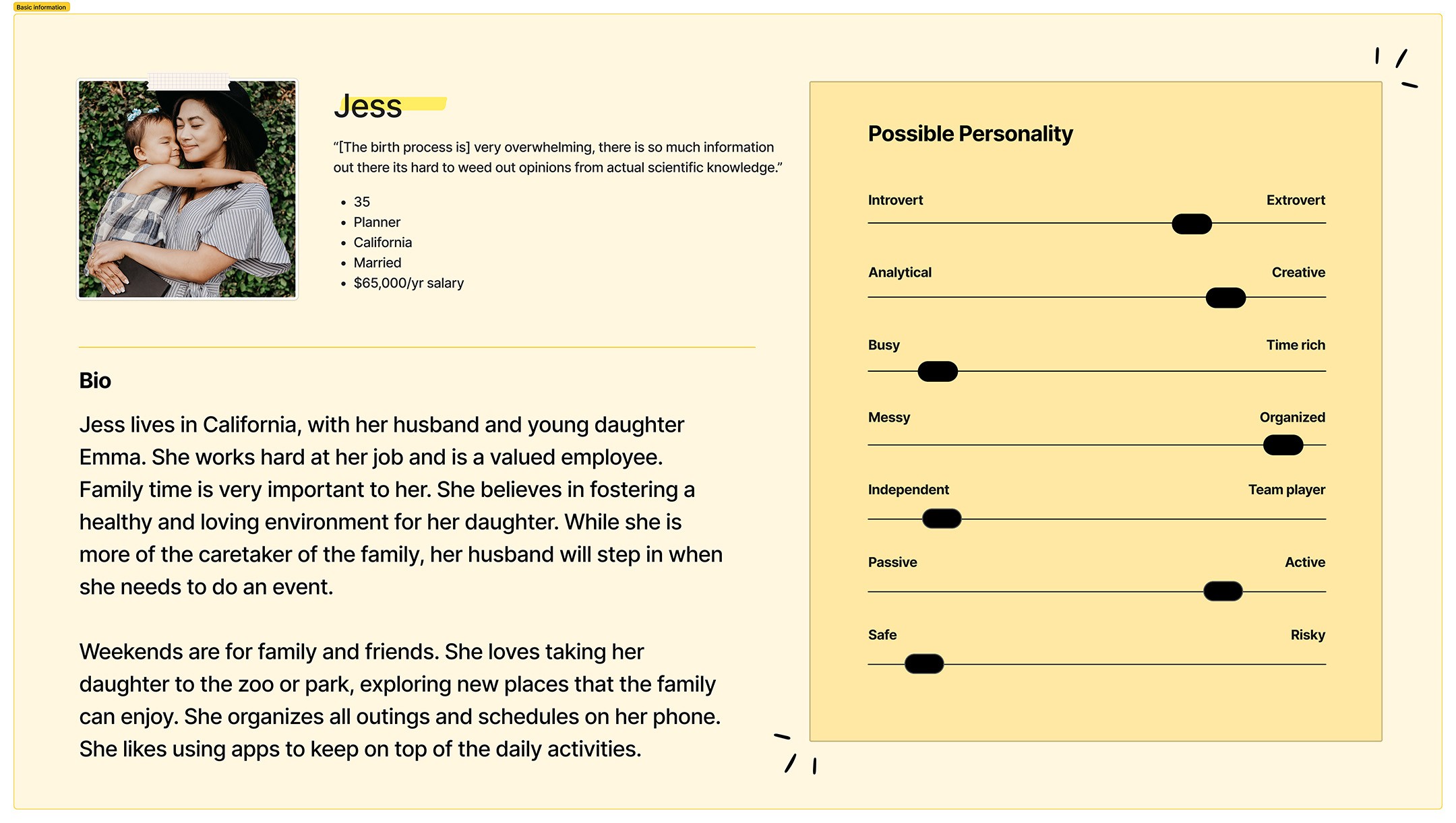
Upon analyzing the data, I observed from my user surveys and 1:1 interviews that mothers tended to seek out apps tailored to pregnancy stages, as the relevant information differs for each stage. This informed my decision to develop a product roadmap highlighting the app's main priorities.
After developing a roadmap plan, I focused on identifying categories for the app's navigation. Through a card sorting process, I crafted a tentative site map that needed user testing.

Molding the Product (use "ing" endings)

Conceptualizing the Brand
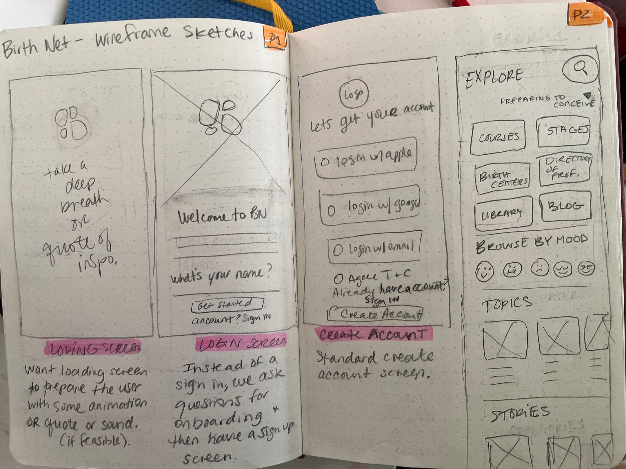
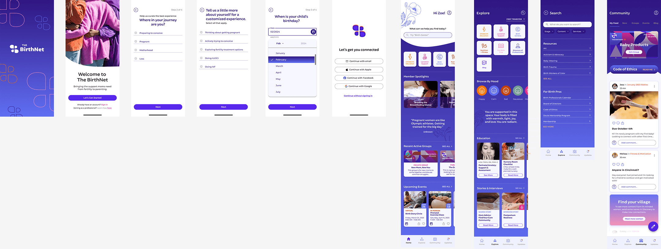
Utilizing my design pattern and user interface analysis, I drafted low-fidelity wireframes for the primary screens. These screens serve as my initial step in visualizing and documenting my thoughts on the app's desired functionality.
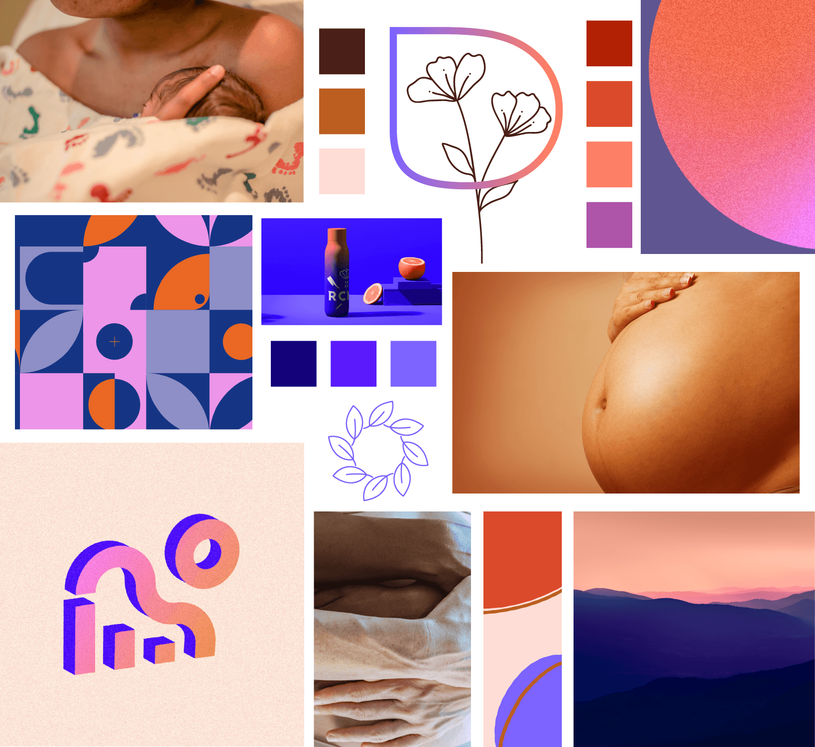
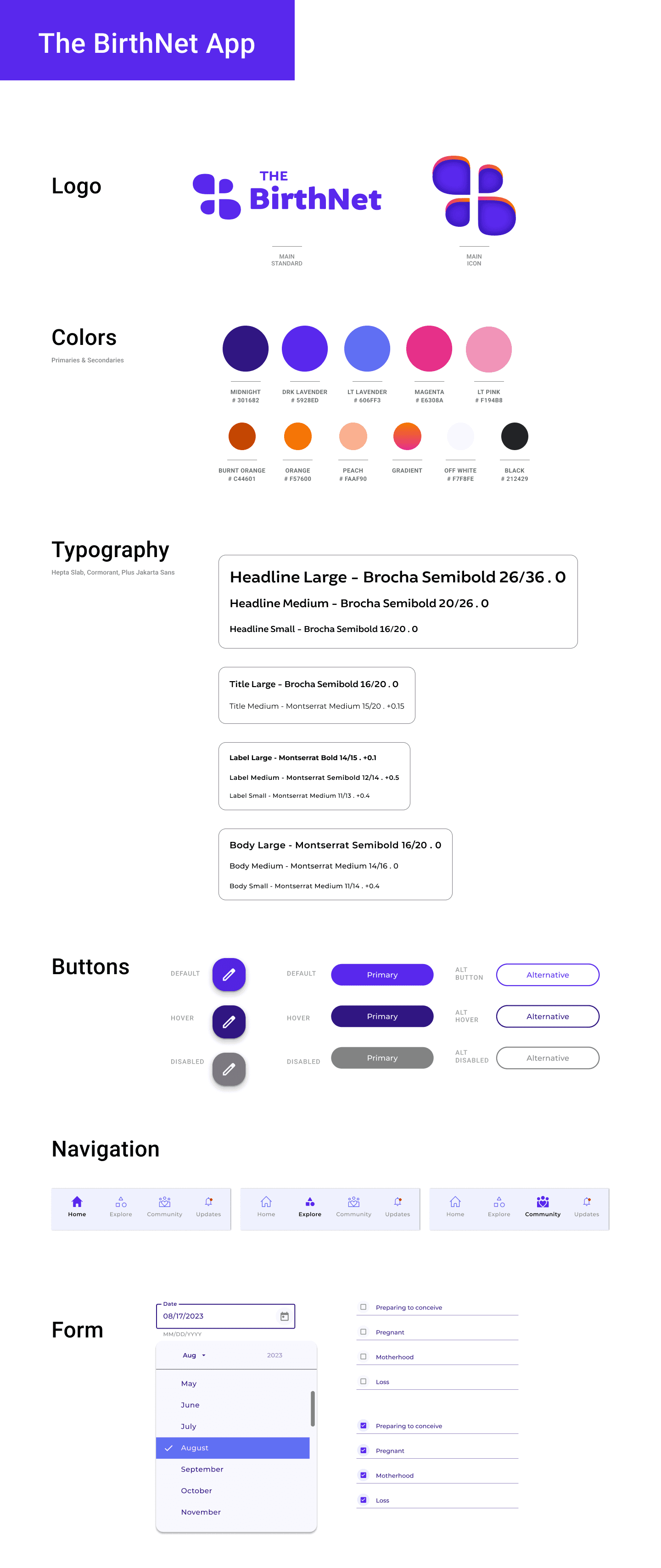
Mood board & Logo
After creating a mood board and analyzing competition, I began designing the UI elements that would serve as the framework for all of my designs.
For the logo, I wanted to play with the letter “B” to create recognizable visual to associate with pregnancy. Once I got the shape of the B, I flipped and reversed the B to connect the idea of a network/connection.
The color palette was going to have cool and warm tones, but lean more towards a calm lavender hues. All the colors fall within the accessibility ranges.
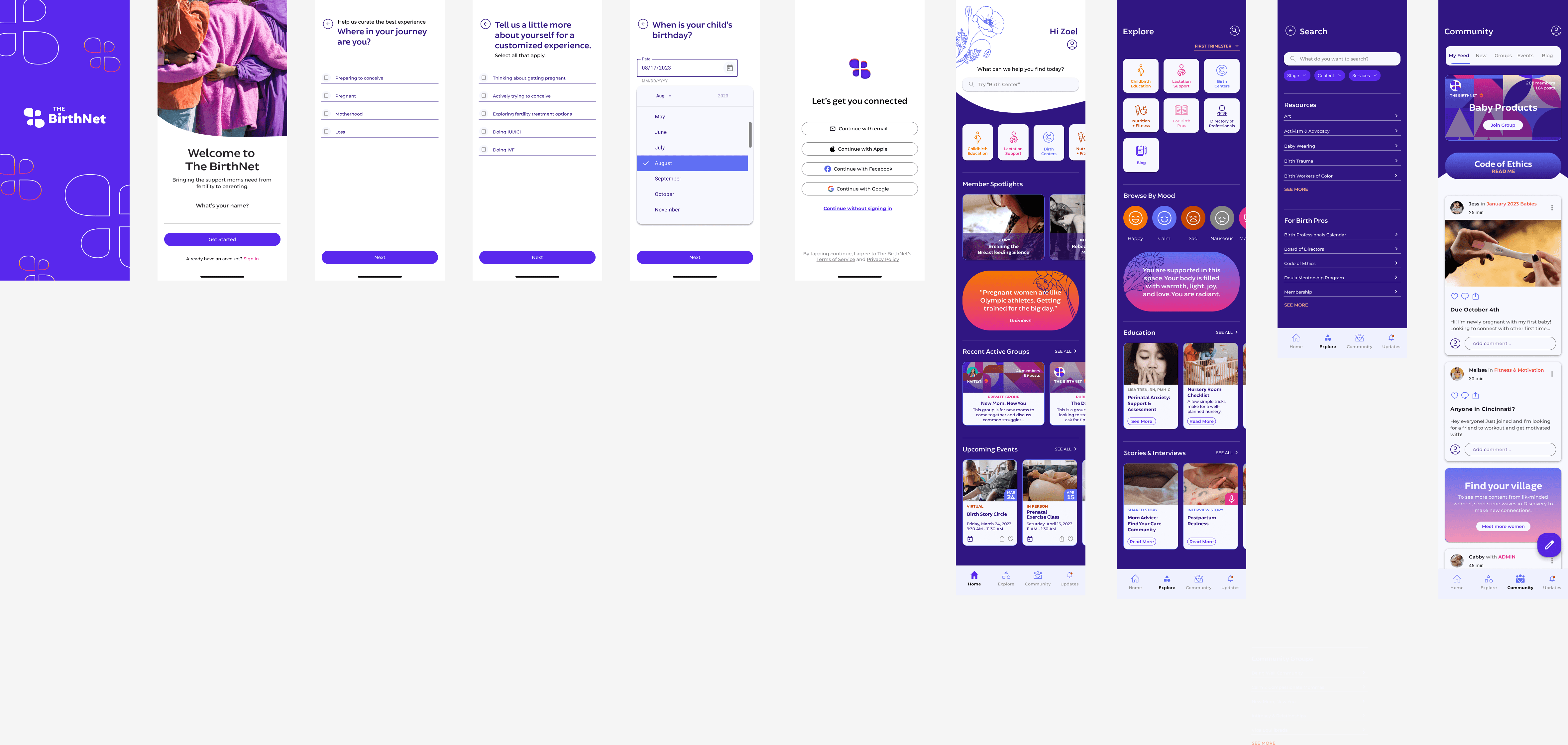
Wireframes
My HiFi wireframes show the main ideas I wanted to get across based on my roadmap, to aid in building out the the prototype to test.
There were some iterations from the original, like accessibility or contrast issues.
Original
Final
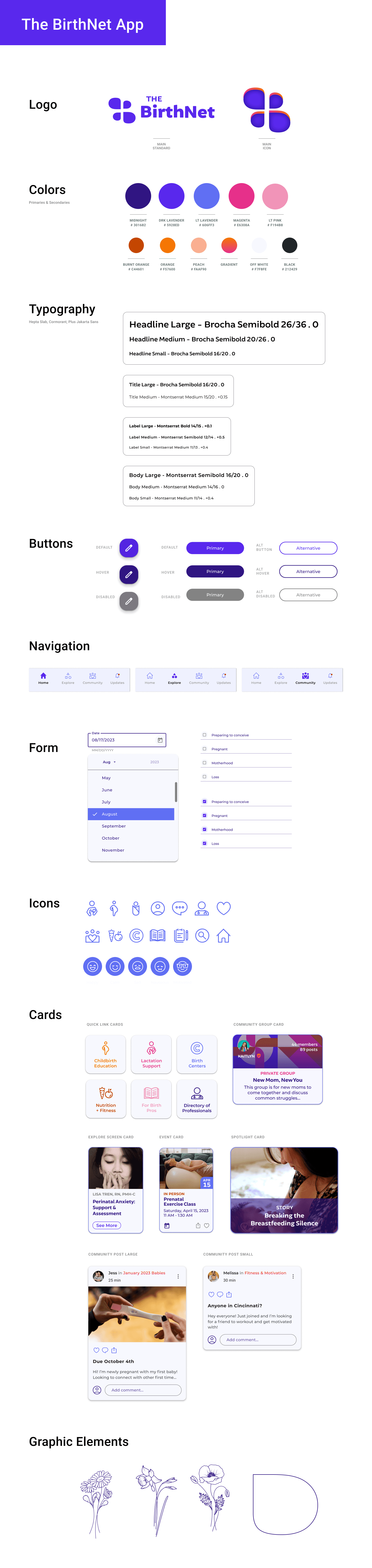
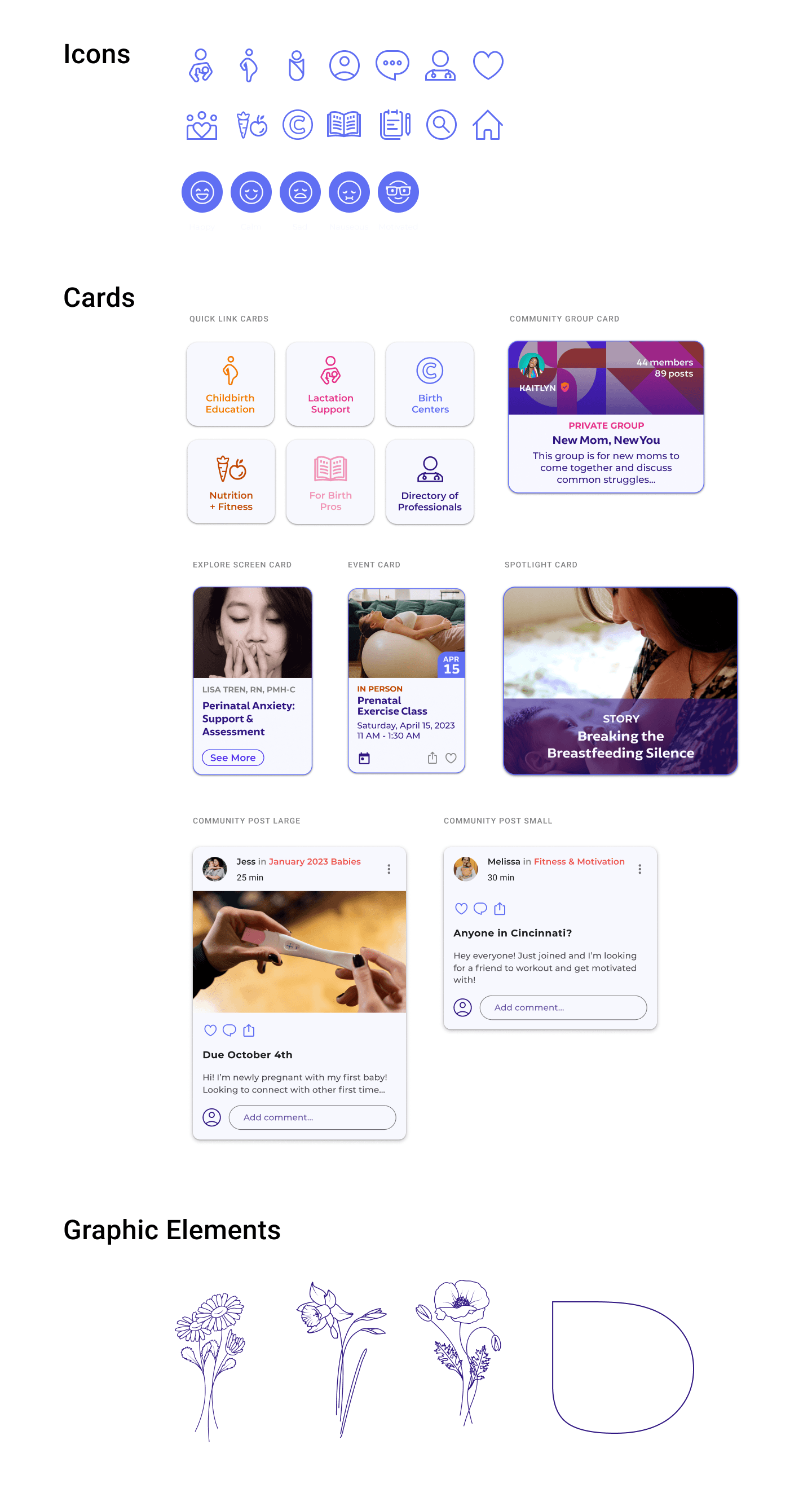
UI Kit
(click image to view file)
The vision for the app was to emote a sense of calm and trustworthiness with a touch of warmth. My color palette & fonts lend to that experience.
I wanted the main buttons and cards to have a subtle tint of the lavender color for a soft finish. The graphic elements I used are flowers to signify growth.
Testing & Iterations
Unmoderated Usability Testing
Objective
Uncover if there are design inconsistencies and usability problems
Test overall flow and ease of navigation
Test the proposed app for credibility
Learn about the user’s behaviors and preferences. Are there any points of confusion, difficulty, or hesitation?
Find opportunities to improve the design
Test the flow of the app and ease of connecting with a professional
Methodology
Conducting a usability test through Maze to test my product. Will collect satisfaction assessment, and suggestions for improvements
Quantitative usability testing
Goal
Have participants complete the tasks without error or confusion. Evaluate participants' feedback to iterate any areas that had pain points. Get feedback on the overall design and flow of the app.
Educational Onboarding
After conducting my usability tests, I created an affinity map with key insights, behaviors, and findings during the tests.
100% of participants completed the proposed tasks. All participants commented on the credibility and professional look, complimenting the design in flow of the app.
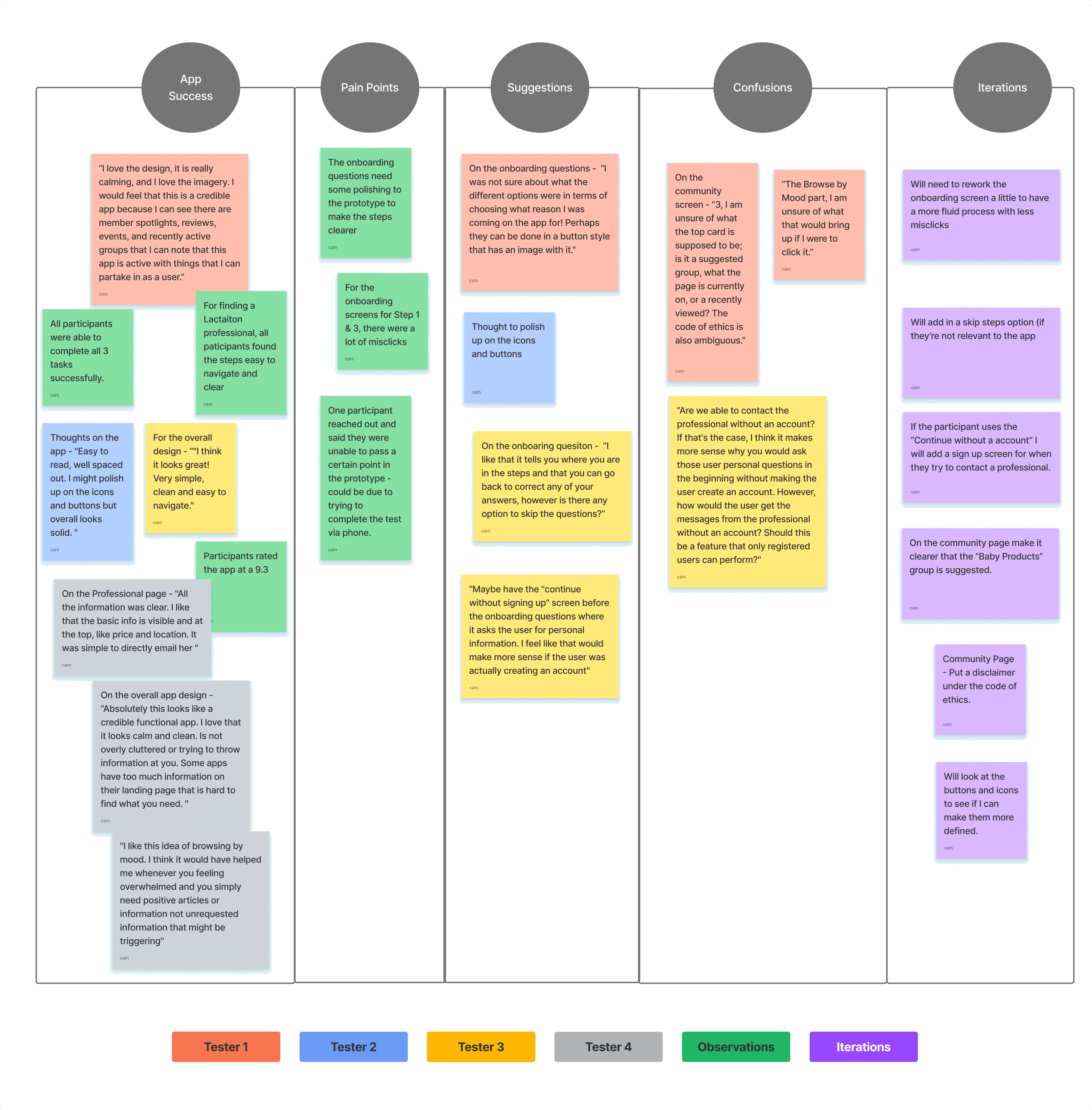
Successes
“I love the design, it is really calming, and I love the imagery. I would feel that this is a credible app because I can see there are member spotlights, reviews, events, and recently active groups that I can note that this app is active with things that I can partake in as a user."
Pain Points
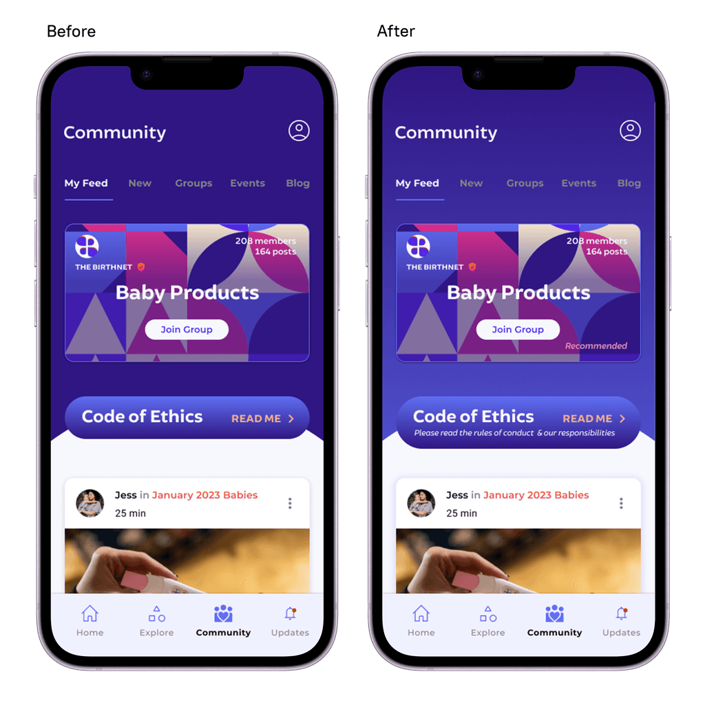
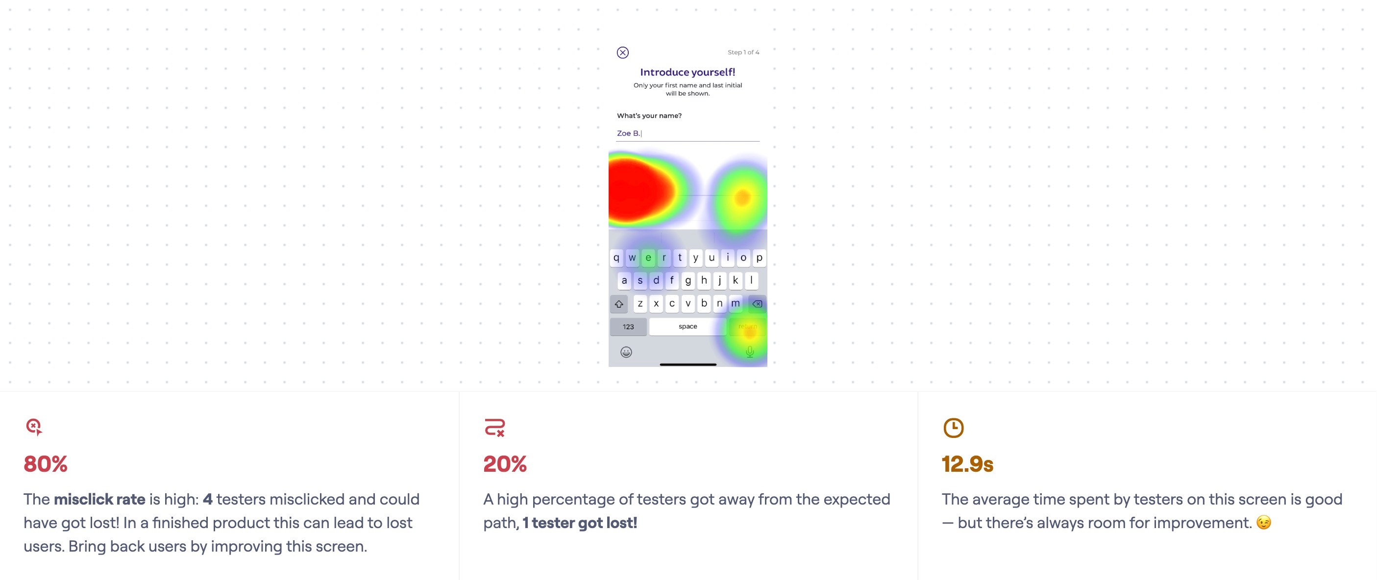
On the community screen - “Score of 3, I am unsure of what the top card is supposed to be; is it a suggested group, what the page is currently on, or a recently viewed? The code of ethics is also ambiguous."
Improvements
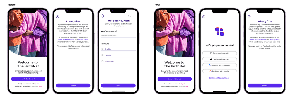
On the onboarding question - “I like that it tells you where you are in the steps and that you can go back to correct any of your answers, however is there any option to skip the questions?”
Insights
Revised Prototype
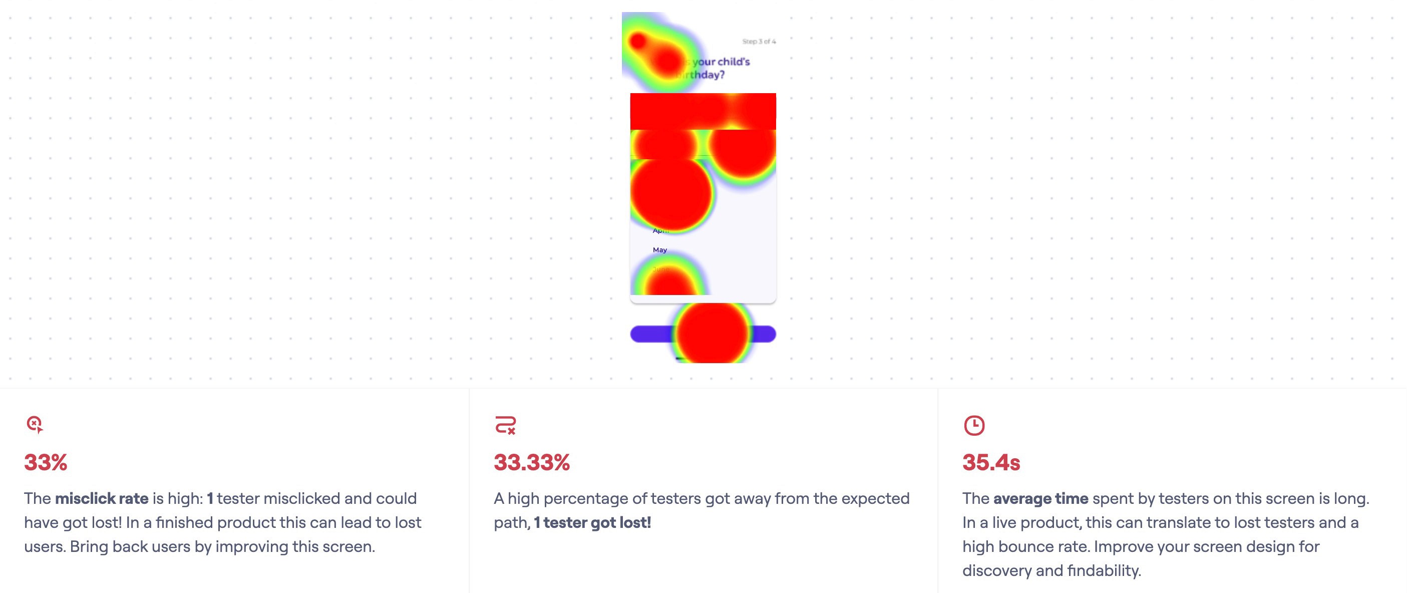
Based on feedback the users provided and the heat map of where there were misclicks, I prioritized these key changes:
Quantitative usability testing
Changed the onboarding screen a little to have a more fluid process with less misclicks
Enlarged the home screen buttons and icons
Added in user options for skipping some of the onboarding screens
Edited the Community page to include a disclaimer for the Code of Ethics.